
Turning influence into impact
Year
2025
Timeline
30 days
Category
Nonprofit Advisory
Goods
Philanthropy has an impact problem. Despite good intentions, too many initiatives fall short because they lack strategic foundation and measurable outcomes. The Social Impact Engineer was created to solve this challenge, giving influential individuals and organizations the tools and framework to transform their reach into real, lasting change. SIE needed a brand identity that could communicate both their analytical rigor and their commitment to genuine transformation.
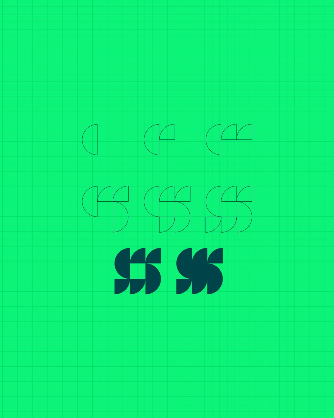
The Social Impact Engineer brand system embodies their analytical approach to creating lasting change. At its core is a logo constructed from precise circle segments, representing both the interconnected nature of social systems and SIE's methodical approach to impact measurement.
This visual foundation extends throughout the brand, with typography that commands attention when delivering key insights while maintaining clarity across all communications. The color system uses strategic contrast to direct focus and support the brand's commitment to substance over style. Every element is designed to work, scaling seamlessly across platforms from digital reports to live events.
Together, it creates a visual blueprint for articulating SIE's messaging across all touchpoints, ensuring their commitment to measurable outcomes translates consistently whether they're presenting research findings or engaging with potential partners.


The Social Impact Engineer logo is built from circles, nothing extra, nothing arbitrary. A system of connection, momentum, and shared effort, mirroring how real impact happens.
More than an aesthetic choice, the modular design ensures flexibility, scalability, and strength across all platforms.


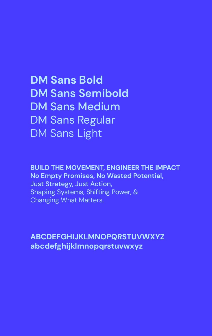

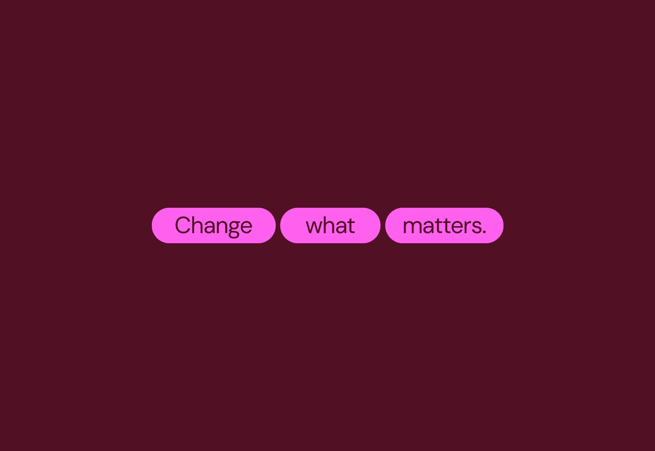
Expressive elements bring weight to key messages with oversized typography and bold framing, designed to stand out without overpowering. Custom parentheses scale up, adding structure and emphasis while keeping layouts dynamic. Icons are clean, functional, and to the point, acting as a quick visual shorthand.

The visual language is sharp, structured, and consistent across every touchpoint, ensuring brand recognition at a glance. Whether digital or print, all brand communications follow a clear, intentional system—typography, color, and layout working in sync to create a unified identity. The result? A brand that’s cohesive, flexible, and instantly recognizable wherever it shows up.


